Though we all love Burp like a childhood sweetheart, we can perhaps agree that she's been looking a bit rough around the edges lately. Age has taken its toll on the familiar features, and as the years roll on you could be forgiven for tactfully suggesting a touch of Botox or a fanny tuck as a birthday treat.
Well, the old girl has been quietly hitting the gym these past few months, and today emerges with a stunning new look that should inflame your passion anew. Here's a quick summary of what's changed.
Firstly, everything looks a whole lot prettier:
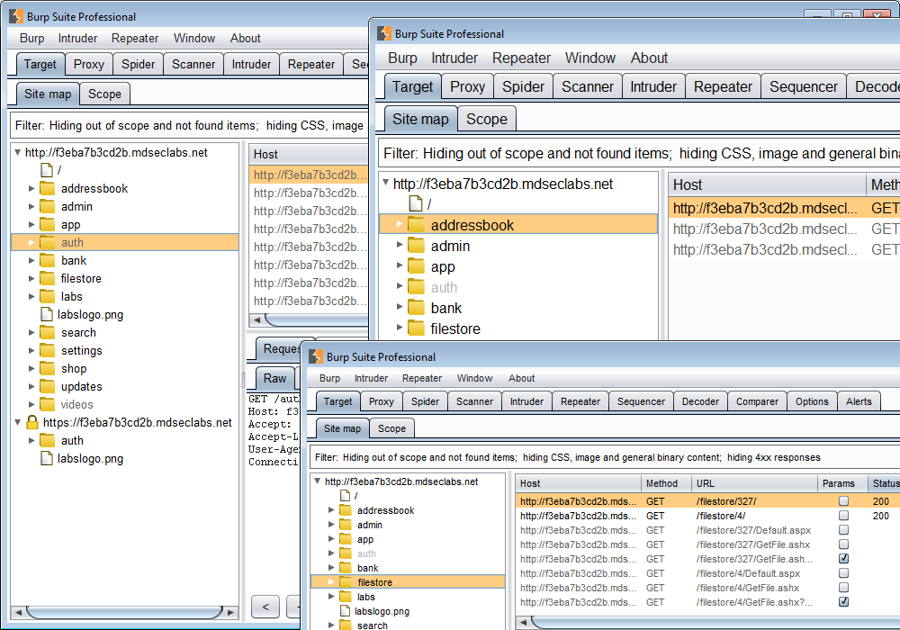
Fonts are now scalable throughout the UI, with corresponding resizing of all UI elements (tables, dialogs, buttons, etc.). Just in time for the Macbook retina display...
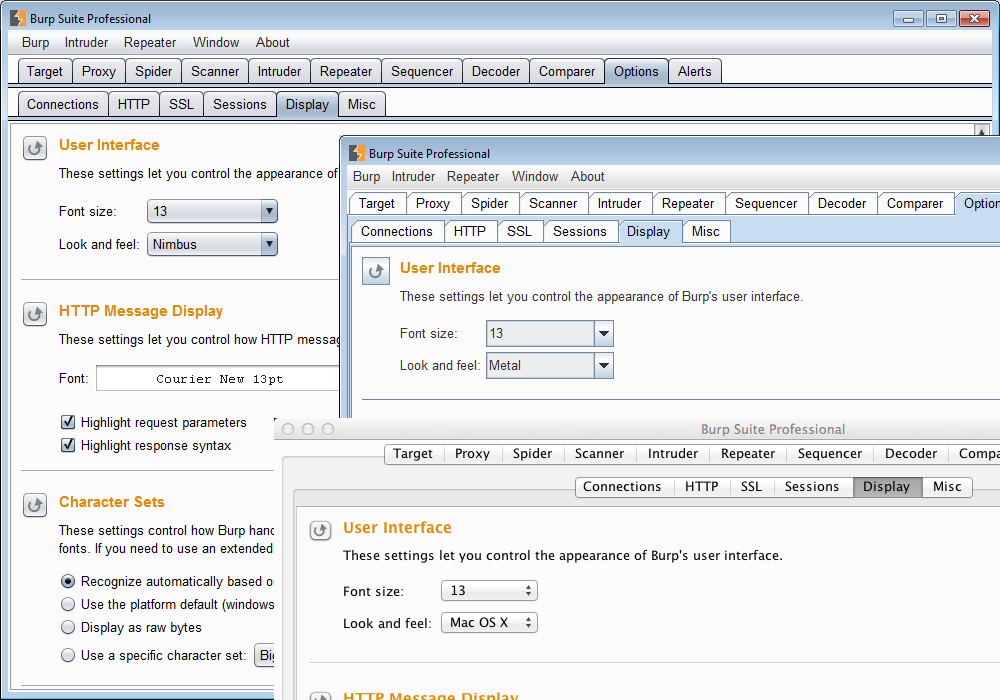
There is support for alternative Java look and feels:
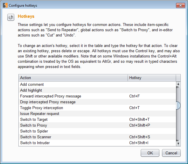
You asked for hotkeys, right? There are tons of them, all configurable:
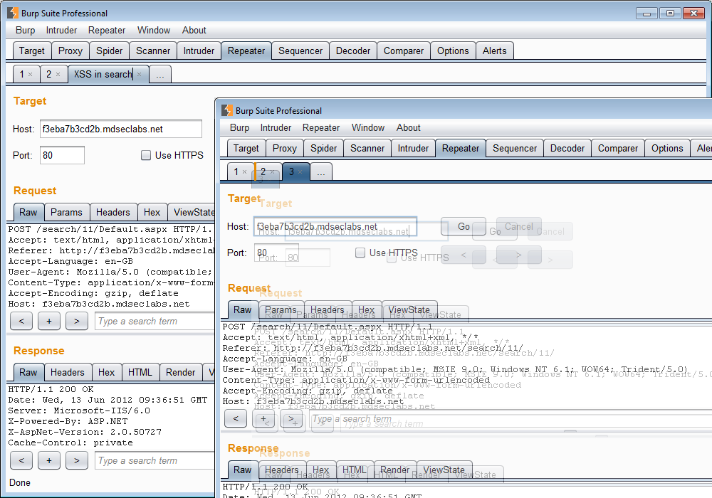
Intruder and Repeater now have smart tabs, which you can drag to reorder, and click to create, close or rename:
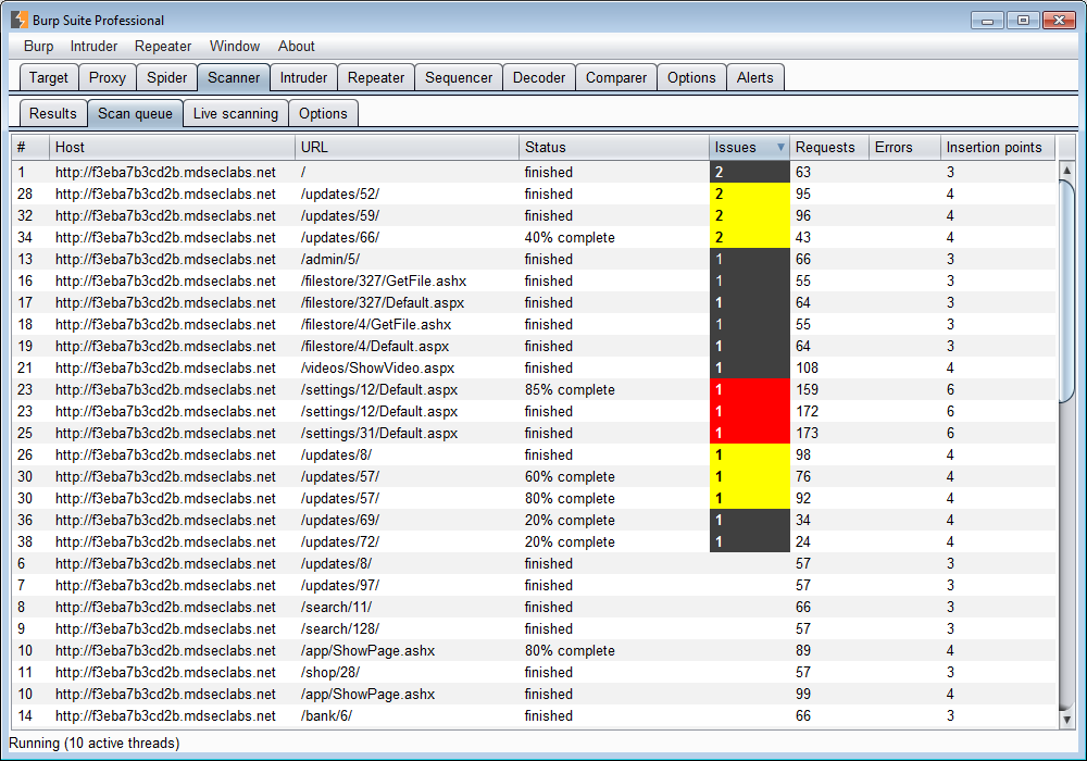
Tables are natively sortable everywhere, except where the row ordering is part of the options you are configuring:
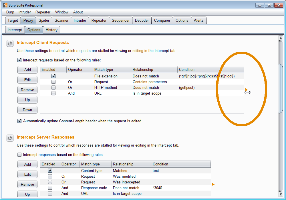
Options tables are also stretchy, if you need extra space:
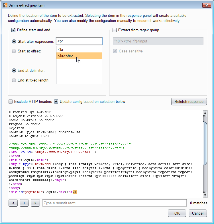
Text fields now have context-aware auto-complete memory:
Now, Burp simply has so much UI, which is so tied up with its core functionality, that the makeover has been quite invasive code-wise. This is effectively a beta release (and for Pro users only). Please do let us know if anything is broken, or performs poorly, or simply looks bad.
Have fun!